This article is the sequel to our series on the making of H – Immersion (see the demo on YouTube). You can read the first and the second parts here: A dive into the making of Immersion ; Texturing a 64kB intro.
In the previous part, we saw how textures are generated in H – Immersion. This time, we’ll have a look at another important tool for size coding: procedural geometry.
More specifically, since our rendering uses traditional polygons, we wrote a procedural mesh generator. We’ll see how with a few well chosen techniques, it is possible to create a variety of shapes, or make a viewer believe we did.
First, Cubes
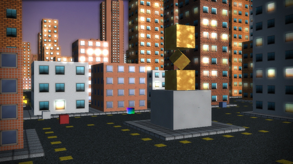
When we started making demos, the 64kB limit felt intimidating. We didn’t know anything about procedural mesh generation, and we already had a lot to do with the rendering, the camera, the textures, the story… well, with everything. So in our first demo, B – Incubation, we took the early decision to skip 3D modeling altogether. Instead, we chose to use only cubes and designed the demo around this concept.
This is an example of how a technical constraint can become a creative challenge, and force us to look for new ideas and do something unexpected. In all of our 64kB intros, the size limitation affects the design, sometimes in small and unexpected ways: we are constantly looking for tricks, code reuse, and workarounds to evade this barrier.

Revolution!
After this first 64kB, it was time to introduce procedural meshes at last! For F – Felix’s Workshop, we implemented some rudimentary mesh generation. The demo received good feedback, but the code is probably simpler than what many people expect.
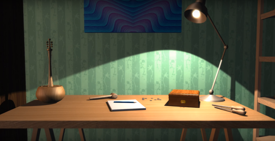
If you pay close attention to the image below, you might notice that there are only two kinds of shapes used by all geometry. Some elements, like the table, the shelf and the wall, are made by assembling deformed cubes. The rest have varied shapes, but are all sort of cylindrical. Indeed we built them using surfaces of revolution.

The idea is to draw simple splines, then rotate them around an axis to create 3D models. Here is the spline we used to create pawns on a chessboard.
The numbers on the left are 2D coordinates of a list of control points. We interpolate between the points using Catmull-Rom splines. Catmull-Rom is a nice algorithm first published in 1974, which Iñigo Quilez details and recommends. The shape on the right is the result (after symmetry) of applying the technique on the list of points.
Once done, we can convert the data to 3D by creating faces along the spline. With little variation we can also create other chess pieces. Here’s the final result.
How many bytes do we need for this? Not too many, especially when you reuse the technique in lots of ways throughout the demo. If we stored each number on one byte, we would need less than 40 bytes of data to represent the pawn… and this doesn’t take into account the compression step.
If you look at the source code for the chessboard, you’ll notice that we actually use a floating-point type to store these integers between 0 and 255. These 32-bit floats use 4 bytes each. Is it a waste of bytes? Not quite: as said in the previous paragraph, the program is compressed. If you check the binary representation of those floats, you’ll see they are very similar and end with a bunch of 0s. The compression tool (kkrunchy) will pack this efficiently, and it can be smaller than if we tried to be smart.
Going further, delta encoding could improve compression rates, but it only becomes beneficial when there’s enough data to store. There’s more to say about floats, and we’ve touched the topic before in the article Making floating point numbers smaller.
Extending and combining

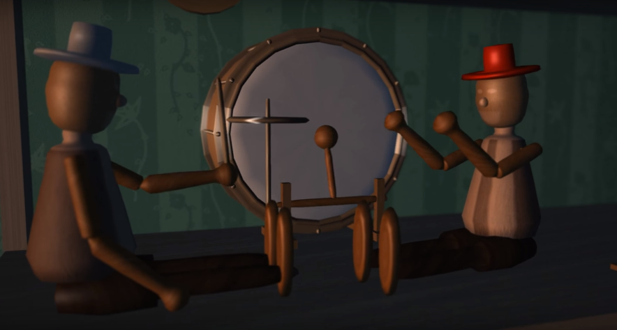
In the scene above, notice how the drum has distinct faces. Our function lets us control the number of faces to generate, so not everything has to be perfectly circular. For example, the pencil on the desk is hexagonal.
In the background of the chess scene, even the white ornament at the top of the hearth is made with this technique: it is built as a pointy octogonal shape. Then the central part is elongated along one axis, resulting in a large shape with beveled corners. We can not only elongate the shape along an axis, but also generate it along a curve. This is how the train ramp is made, with its path described by another spline.
If you watch again Felix’s Workshop, you can see how everything comes either from a revolution or from a cube. We create a wide range of objects just by combining these two primitives.
Growing Cubes
Combining and deforming simple cubes also has a lot of potential. For the vegetation in H – Immersion, we started from a cuboid, and deformed it a bit. Then we made many copies of the mesh placed vertically around an imaginary axis, with random size and orientation. This creates something that vaguely looks like a plant. We repeat, again with random parameters, to create more of them:
This looks very rough and you’re probably expecting to read what the next steps are to refine the shape. There aren’t any: this is the final mesh. We didn’t even create a custom texture for it. Instead, we just applied the ground texture on that mesh!
But during the demo, the effect works well enough thanks to the rendering, the lights and shadows, and a simple but convincing animation. The editing also helps a lot: the shapes and movements set the mood, but the viewer doesn’t have time to notice the details before the camera moves on. Sometimes evoking a shape with a proper mood is more effective than painstakingly modeling it.
Extruding Cubes
At some point, we wanted to have more complex meshes. As usual, we started from our beloved cube and decided to modify it. Merely deforming a cube will still result in.. well, a cuboid. So we needed something more. Enters extrusion: we pick a face, and extrude it. This operation will create a new face, which we can pull from the object, resize, or transform in any way we like.
We iterate multiple times, to create the shape we want. Each extrusion will add more details. The result is often low poly, but we use the Catmull-Clark subdivision algorithm to smooth the result out. This approach was inspired by the Qoob modeling tool.
What we’ve described is exactly what we did to generate the small statues used as decorating props in several places during the demo:
Since it’s all procedural generation, we can pass arguments to the function. These arguments can control some angles for the legs, arms, etc. Write a loop generating lots of statues with random parameters, et voilà! You have enough variation, so that it doesn’t get visually boring.
We also created two statues with hard-coded parameters, for better results. Here is how it looks after applying textures and lighting.
And of course, statues are reused: we’ve also put variations of those on top of a fountain created with a revolution surface.
Marching Cubes
In the temple, we wanted to show a colossal statue of Poseidon seating on its throne. The technique used for the small statues was too rough for a model that would have more focus. Poseidon is huge and we wanted more details. The demo has a lot of content and fitting everything was a challenge. After a lot of size optimization work, we managed to get around one spare kilobyte. We decided to use it to get a better model for Poseidon.
To do so, we used a completely different technique than what we’ve seen so far: implicit surface expressed with signed-distance fields (SDF). This is a technique very popular in 4kB intros, usually used with the ray marching algorithm to generate the result, and implemented as a screenspace shader. But since our rendering is based on meshes, we generated a polygon mesh by evaluating the SDF function with a marching cube algorithm instead of ray marching. We built the humanoid shape as a series of segments, with a little bit of tweaking to give it an organic look.
On the right, the normals estimated from the triangle mesh reveal the sampling grid, but hide the structure and give a desirable rough looking shape.
There was only so much detail we could afford, not to mention that modeling humans is difficult and people are very good at spotting issues in human-like models. We used to our advantage the low resolution of the generated mesh. It turns out that evaluating the normals on the final mesh (as opposed to deducing them from the SDF function) creates visible artifacts: the surface is full of smooth creases and edges. This very rough appearance can give sort of a sculpture look. We used lighting and cinematographic techniques on top of that to trick the viewer into filling the details. In the final shot, the statue seems more detailed than it actually is.
Online Cubes
In creative activities, it is often crucial to iterate quickly on a design. You cannot do everything right from the first try, so you need to easily make changes, iterate, explore, see what works.
At some point, we put our mesh generator on a web server, just like we did with the textures. The webpage had a textarea where we could write C++ code. When we clicked on a button, it compiled the code on the server and returned the mesh in a JSON format. The webpage displayed the result with three.js, so that we could view and rotate the model with the mouse. Just like in Shadertoy, this allowed us to quickly try ideas, share them with the team, fork and tweak other models.
We later moved to a different solution, C++ recompilation, which we mentioned in the first part.
Conclusion
Mesh generation is arguably more difficult to design and more involved to implement than texture generation. When textures are just flat surfaces, meshes have different topologies, which adds a new layer of complexity.
But like with textures, the simplest building blocks can offer a wide range of possibilities to explore, as long as it’s possible to combine them in various ways. A few simple elements used creatively can give a wide range of shapes.
Moreover, as we’ve seen with at least two examples, the power of suggestion can play an important part and replace modeling work that would be tedious or even impossible to do with the available building blocks.
Using both of these observations can go a long way, as we hope to have demonstrated. The trick is to find the right balance between modeling work and expressiveness.

Love this. I’ve been a casual fan of demoscene since my college days in 2000
Nice!…and very nostalgic… :-)
Reminds me of the C64 and early PC demo-scene from the 80’s and early 90’s. We need more of this in our bloated games.