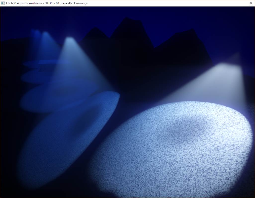
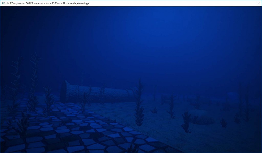
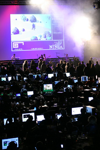
Earlier this month, the large demoscene Easter meeting, Revision, took place with all its range of events and competitions, despite a new online format due to the pandemic situation. One of those competitions is the Shader Showdown: a tournament where participants are to write the best possible visual effect within a limited time. Each round opposes two of them on stage for 25 minutes while a DJ is playing and the public is cheering. At the end of the round, the public decides the winner who moves up to the next round.
After this year’s competition, Friol interviewed six contestants, including the winners of the last three editions:
- ferris is a software engineer coming from the US. He’s currently working on machine learning processors for Graphcore in Norway.
- fizzer comes from the UK and is currently living in Finland. He is a graphics engineer who has been working on Cinema4D before doing GPU path tracing in Notch, a tool to create visual effects for events and concerts.
- Flopine is a French PhD student in digital art and a technical artist at Dontnod. She won the Revision Shader Showdown 2020.
- Gargaj is a Hungarian game developer. He has worked on the indie MMO Perpetuum before moving to the AAA industry with the Project CARS racing game series.
- NuSan is a French technical artist who works in the game studio Dontnod and also creates small video games with Unity and PICO-8. He is the 2019 winner of the Revision Shader Showdown.
- provod is a Russian software engineer from Siberia who recently moved to California and is currently working on the game platform Roblox. He won the Revision Shader Showdown in 2018.
For reasons we will not elaborate on, the original article was eventually withdrawn. With their permission, we’re sharing here their stories and insights for everyone to read.
What is this all about?
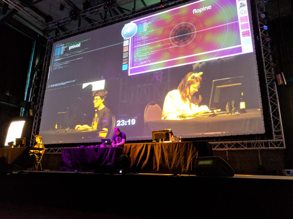
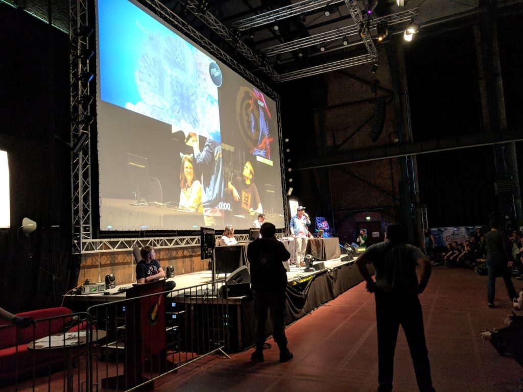
Whether it is at home, during a stream on Twitch, or as a performance during a live event, live coding consists in writing code with immediate visual feedback. In this article, it refers more specifically to writing a shader effect on stage to entertain an audience. At Revision and several other demoparties, participants have a given time to write their effect from scratch. A DJ is accompanying them with a live mix, and their code and its result are projected on a big screen for everyone to see, in a collaborative audio-visual performance.
When asked to define live coding, ferris mentioned a “competitive aspect which makes it at least e-sports like, while still being an inherently artistic medium”. Gargaj pointed out that “the shaders themselves are rarely rewatched afterwards”, unlike “a good demo that lasts years to come”. His comments emphasized the “in-the-moment performance”, comparing it to “rap or beatbox battles”. fizzer further described the “various twists and build-ups that occur during the coding session”, comparing it to the World Cup. “The end result does of course matter, but everyone shows up to watch the game in full because that’s where the excitement is”, he added.
This early video from 2011 can be a good introduction to shader live coding. It presents some simple 2D effects that are relatively accessible for a new programmer, compared to the 3D effects and advanced tricks seen in live coding competitions:
When did you first hear of live coding in the demoscene?
Flopine: When I entered Revision’s main Hall in 2016. I didn’t know it existed at all! That people would code live in front of others…
fizzer: I think it was when I read about IQ coding shaders as a member of Beautypi, which was a group that put on a show with live music and visuals. It wasn’t competitive, but it was live and I thought back then that it must be extremely difficult. It turned out of course that many years later it would be made an official competition at Revision and I found it to be quite fun when I tried it myself!
provod: At the demoparty WeCan 2013 in Poland. I was accidentally visiting this party (was visiting friends in Germany and became aware of a demoparty nearby) and only at the party place noticed that they had a live coding competition. A few years before that I had a rather small experience of doing music performances live coding PureData patches and live soldering custom digital synthesizers on stage, so that thrill looked like a lot of fun, even though I only began exploring shaders back then. So I just applied as a contestant and got selected.
I’ve heard about live coding performances before that outside demoscene, mostly in the experimental electronic music scene. I always wanted to try doing something like that also with visuals myself, so I guess it felt like a good opportunity to just try.
ferris: In the form it is now, I guess 5+ years ago. I’m not sure exactly when. But I was aware of the first competition at WeCan (I think that’s where it was?) and I helped do some mac fixes for Bonzomatic in 2015 or so (which I think were superseded by more proper work by alkama etc) and I’ve tried to participate in most of the competitions that were happening at parties that I was attending around that time, especially as Solskogen was embracing them.
That said, I remember there being compos with a similar format long before this. The “drunk master coding compo” comes to mind, which I never personally saw, but heard about from the likes of kusma / excess and a few others. I believe this was a feature of Kindergarden in Norway, but I’m not sure. This was more theme-focused, i.e. make a “texture mapped tunnel” and every time you hit compile you had to take a shot. Or something. :)
NuSan: I saw some people live coding sounds at local concerts. I also saw some live coding by IQ around 2012 on his youtube channel, but it’s really Revision 2018 live stream when I saw a proper shader showdown and that blew my mind.
fizzer: Actually I had never heard of live coding before I came across it in the demoscene. I had tried a few times to code something in a limited amount of time as a challenge for myself, such as coding an effect on a laptop during a train journey home, but I hadn’t ever imagined it as a real sport. I think it’s quite futuristic.
The editors
If live coding is a sport, the editor is its field, where the champions show their skills. Two shader live coding editors popular in the demoscene are ShaderToy and Bonzomatic. ShaderToy is a creative website where a community writes and shares shaders. It is a very nice place to find shaders and analyze how they are made. Bonzomatic is a software focusing on live shader competitions. Its author Gargaj shared the story behind the creation of Bonzomatic.
Gargaj: I know live coding has been a thing outside the scene since the mid-2000s, but I never really saw an appeal because the people doing it in “algoraves” were usually using very basic graphics or sound libraries. So the actual results were never particularly pleasant, and they were always somehow laced with an influence for either databending or 8-bit or both, which got really old after a while, and I never really saw the appeal.
The demoscene insertion happened when Bonzaj and Misz came up with the idea for WeCan 2013 and they created the competition using two projectors and a custom editor integrated into with Visual Studio; D.Fox (editor’s note: D.Fox is the lead organizer of Revision) liked the idea and tried to bring it to Revision 2014, but when it was announced (about a week or two before the party). I saw the package they were trying to use, which was really janky and obviously required extra hardware. Just to prove a point I found a Github repo by a guy called Sopyer that implemented a syntax highlighting editor over OpenGL, and within about 2 hours I had the basics for a tool that was able to show a shader that was being ran and recompiled. I then merged in some of Bonzaj’s code (like the FFT and MIDI code), and posted it back on Pouet. After the party itself, I was aware of the many bugs and the overall hacky nature of the editor, so I decided to write one from the ground up with a bit more thought and cleaner basics in mind. When I was looking for a name, I obviously thought of Bonzaj again and named it after him — something which he apparently never realized until years later.
When asked about the editor, the participants have all sorts of suggestions as to where to take it next. At a basic level, provod regrets the lack of a vi mode causing him to “feel crippled, and sometimes do slip live” while Flopine found its automatic indentation frustrating. To “keep the concept fresh”, fizzer suggests high level features like multipass shaders which “would allow a lot of unseen effects”, and mentions how a stateful shader would make effects “from basic feedback zoomers right up to physics and particle simulations” possible. These features became available in ShaderToy in 2016, enabling such effects.
NuSan was more interested in collaborative editing. The Cookie collective experimented that idea recently with a collaborative live coding where several coders were editing a shader simultaneously. Going further, fizzer wonders “what it would be like if the two contestants had access to each other’s shader output as an input texture”.
The heat of the competition
“I generally think that it doesn’t make sense to be alive and not constantly try to do the most complex and exhausting stuff in the dumbest way possible and with the silliest look.” — provod
Do you prepare for a live coding competition?
provod: Usually I do. I did not prepare for WeCan 2013 at all, however, and entered it at the party place on a whim really. It had a different format where you could continue to work on your shader in the next round, and in fact I immediately started making very specific preparations between rounds when I got the hang of it after the first round.
For subsequent compos I looked at participants list, got scared by all the big names, and decided that if I’m to at least show something comparable I should really have a few techniques memorized and should try to train myself to make a few scenes with these techniques combinations. I don’t do graphics professionally, and I’m not always involved with demoscene, so it’s not rare that there are a few consecutive months in which I don’t touch shaders (or any graphics stuff really) at all, so skills get very rusty. :D I certainly would not be able to write anything coherent if e.g. I forgot all the relevant math.
Usually a week or two before the compo I try to make a list of techniques to rehearse (e.g. raymarching basic loop, normals, basic shading) that I should be able to write with my eyes closed in a few minutes. Then I come up with a few scenes, maybe remember some ideas I had and did not have time to try previously. Then I just set up a timer and try a scene. Then I try to tweak a scene for a few hours to feel its “phase space” and get an idea what works and what doesn’t. Some of these end up being 4kB intros later :D.
NuSan: I try to train myself regularly by doing a shader coding live stream on Twitch each week so I have some pressure from an audience.
Before an important showdown like the ones from Revision, I try to find an idea that could be original. A few hours before the match I mess around in Bonzomatic with that idea and try to find a nice visual target.
Flopine: I’m always prepared because I absolutely love coding shaders, thus I’m doing it all year long. And before a match or a VJ set, I usually practice and test ideas 2 hours before, until it’s my turn to go on stage! For the Revision showdown I often have 2 ideas at least, and then for the finals I’m always surprised and need to improvise more because I never think I’ll be able to pass the quarter and semi-finals!
Nusan: I don’t try to memorize each value or piece of code, it’s more about what steps I want to follow, so that once in the match I already know where to start and where to go. I don’t prepare for more than one round and usually there is at least an hour between two rounds so I can find a new idea. It’s a good process to get something cool on the screen without destroying all improvisation.
provod: I try to have at least three solid scene ideas each of which I can do within 20 minutes and tweak in the remaining minutes. There’s an interesting meta with these scenes, which scene I should play against whom and in which order. And I think I completely failed the meta for the past two Revision parties!
It doesn’t mean that I have a super rigid scene idea for each round that I just type out (there were people doing this, I think, but my memory is way worse than that). Scene is mostly a vague pointer to a collection rendering techniques, geometries and maybe palette and camera movements. For some rounds I wasn’t sure what exactly I was doing before I started typing. And for some I just went and combined things from different scenes I practiced previously.
fizzer: When I know that I will be doing any kind of live coding, I brush up on basic flexible effects that I can code out quickly at the start. So during a round I will start with one of those and then just improvise on top of that. I think this is a nice compromise between going in cold and memorising an entire shader. Complete memorisation can be very risky. If it goes wrong, the time that it takes to come up with a Plan B can be significant. Likewise, if you have memorised some basic small effects that take little time to code then you have the choice of switching to another effect mid-round if it’s not going so well. You can also entertain the audience better that way, by making big changes to your shader mid-round.
What kind of shader will win over the audience?
Gargaj: That’s always a tough one, sometimes it’s just sheer visual splendor, sometimes it’s hitting the right note with the audience, sometimes it’s doing something more interesting than the other person even if it’s not as good looking. Plus there’s always audience bias as well :)
provod: Path tracing! It’s super trivial to do, and any random crap rendered with it looks good. It’s like pentatonic scale :D.
ferris: It depends on the audience of course. It’s the same with demos – people like what they like. For the demoscene, a cool 3D scene with lots of shiny things will often win. However, sometimes a very stylistic 2D shader will also win if it captures the audience (which is particularly common if it appeals to an “oldschool” palate, eg. by using a classic C64 color scheme/dithering style).
NuSan: Making some 2D neon lasers rotating in all directions always gives a good effect.
Flopine: The MirrorOctant from mercury sdf library! Such a cool way to duplicate space seamlessly. That function combined with a cool shape and maybe an angular repetition can win almost all shader showdown matches I’ve been into :) but I like to try different things because I don’t want to do stuff that are “too easy” on stage.
Any particularly memorable live coding event?
NuSan: My first shader showdown in public (at Cookie demoparty) was very intense, my fingers were shaking but it was awesome. I had some bad live coding sessions mostly when I’m tired or if I do several sessions in a row. After a while, you can’t really think anymore and your creativity runs dry. Then it’s not fun and usually you lose ^^.
Flopine: The first time I went on stage at Revision 2018 will remain in my memory for decades I think!
So exciting, so many emotions and fun… I think I want to feel that again over and over, that might be why I’m doing a lot of showdowns, but obviously (and unfortunately) the feelings are never as strong as they were the first time!
fizzer: A terrible one. It was Revision 2018. I had requested (or so I thought) to be coding in GLSL, but my computer on-stage had been set up for HLSL. This would ordinarily not be a huge problem, except that I didn’t notice this problem until some minutes into the round. I had no idea how to switch the shader language, and in my focused state of mind I had no choice but to continue, rewrite the code I had written in GLSL into HLSL and make the most of it. I still can’t believe that I was able to keep coding coherently after that!
provod: The whole Revision 2018 experience was completely surreal, I felt like such a huge impostor really.
I was recovering from a severe flu (had been hospitalized just a few days before the party), so the preparation was interrupted, was sleep deprived due to long flights from Siberia, and also was desperately trying to finish a 4k and 8k before their deadlines. I did not expect to be able to write anything coherent on stage, even less so to win against all those strong sceners I still consider lightyears ahead of me.
“Absolute panic”
On the third day of Revision 2020, a DJ set took place, together with another live coding event. Unlike the competition rounds, this session was much longer and not meant to be a competition, and more of a freestyle VJ. Accompanying Bullet during his mix, it featured not two, but three participants: Flopine, Gargaj, and IQ. IQ is widely known for having pioneered many ray marching techniques, creating the vegetation in Pixar’s film Brave, and being the coauthor of ShaderToy.
Gargaj talked about his reaction when he was asked to take part in the event.
Gargaj: Oh my first reaction was absolute panic when I found out at around 1:30AM that they want me in it too, and then just mounting anxiety. Then the whole thing kicked off and I just locked in to the keyboard and the screen. Aside from the quick HLSL-to-GLSL port, my focus narrowed in so much that I didn’t watch the stream, had no idea what the other two were doing, and completely forgot about the relaxo-beer I opened myself 10 seconds earlier. I don’t know if I’d call it “fun” to be honest, because while I was incredibly lucky that the idea I decided to go with worked out, it was really just luck and it could’ve been equally as much of a disaster with me staring at a blank screen for an hour. I really genuinely dislike things that have a time limit and try to actively avoid them.
I got to participate (and let’s face it, totally undeservedly, compared to what others can do) against the two best people who do this, so it was at the very least a good entry on my demoscene CV. :) But I don’t know if I ever want to do it again.
Gargaj recently wrote the article A breakdown of the Revision 2020 Threeway Battle, where he explains in detail how he made the shader.
Stepping back
“It’s important to have fun during a match or else the pressure can be a pain.” — NuSan
Did live coding shaders get better with time, technically?
Flopine: For me I’m getting better each year, but not because I’m working on the same thing again and again. I’m learning new things every month and filling my own palette of techniques with them, which helps me build more complex/mastered images in my opinion.
In general, live coding shaders is also becoming better and better technically because intros and 4k are getting better and better! I once saw a path-traced shader typed under 25 minutes for a showdown! I think the demoscene and also papers that come out of research labs will continue to improve, thus improving what type of effect you can make in 25 minutes.
Gargaj: I don’t know, I don’t remember the first ones; if they’ve gotten better, I think it’s because people learned to scope the 25 minutes in better and started to explore more ideas.
NuSan: I think that live coding did get better, as new techniques are found regularly. Also there is a lot of knowledge sharing between demosceners so we can all improve, for example with shadertoy and live coding streams. Then some tricks might sometimes get lost, and also we are maybe too focused on technical skills and impressive shaders. We could spend more time on simpler but more improvised shaders that would be more personal and maybe fit the music better.
ferris: I think they’ve peaked a bit actually, and I think it has to do with a certain overlap of 1. what people can conceive of in their heads with such a limited format and 2. the round time limit. Admittedly I think it’s usually a bit stale, though we are seeing better and more impressive space folding/lighting stuff as GPUs get faster in particular. In fact I think GPU technology advancements are what drive live coding advancements more than coder skill, but it’s certainly not the only factor.
fizzer: I think they did. When the event was first introduced at Revision it was totally new. The idea of having the volume of the cheering from the audience dictate the winner in a very subjective manner was even more radical. It was quite hard to guess how it would work, and what the best strategy would be, how much stress it would be to code on stage in front of everyone. I think now it’s quite well established what makes a good live coding round and what to expect from it. It’s getting more intense every year, and some participants are effectively training all year round by doing time-limited live coding streams on Twitch in their own time, for example. I’ve been out of the game for a while, but I may yet return. We’ll see.
provod: Absolutely! My impression is that previously people generally were just improvising on the spot.
But for the past year or two I see people both make special preparations for live coding compos (you can see that from the way people write complex scenes with great confidence) and keep themselves in good shape and are constantly refining their skills by doing shaders regularly. Like NuSan, evvvvil and Flopine streaming on Twitch (i’m sure there are other sceners who also stream shaders but I can’t remember them all). Unfortunately, I don’t have a time budget to keep a similar routine.
Does live coding require distinct skills from coding?
Flopine: The demoscene is full of super great coders that don’t livecode! Live coding is stressful not only because you have to type and think fast, but also because you have to be present, to be on stage in front of hundreds of people that will judge both your production AND the code of it. I think a super talented coder needs to be sure every line is in its right place, that he does not implement something in a dull way or whatever… but in a live coding environment you don’t have time to think about all those!
ferris: Frankly I think the best coders are the ones that take their time and do something more comprehensive. live coding to me isn’t better/worse, it’s a very different thing, and it’s an odd skillset that to me doesn’t really overlap much with what I’ve typically thought of as “best” coding skills, though I have a lot of respect for it certainly!
NuSan: Live coding is a very special thing, focused around short and intense sessions. Also you have to sacrifice some elegance in coding style to get faster. Some coders prefer having time and peace of mind while creating and it doesn’t make them less impressive. Right now, I like live coding because it lets me create fast and I don’t have the patience to take my time.
provod: Yes. You have to be able to do a lot of stuff consistently in a very limited time and under quite a bit of pressure. Not everyone will find this fun.
It is also laser focused on short-term results sacrificing everything else, so it’s kind of orthogonal or even outright adversarial to other code writing dimensions like code quality, performance, cleanliness etc, which are very important in real life, and lack of which would cause physical pain to many great coders I know.
Who is the livecoder in the demoscene you appreciate the most?
fizzer: I would have to say Flopine, she has a real sense of showmanship and personality resulting in a real cool performance when she is live coding, and the shaders she produces are likewise always charming and funny. In the demoscene it was a bit like she came out of nowhere and suddenly started making these awesome live coding performances. She has also produced demos besides that too, and is very active online sharing her code and livestreaming on Twitch and such.
Gargaj: That’s a tough one; the NuSan / Evvvvil battle this friday was probably the most insane thing I’ve ever seen, and yet when you ask the question, I find myself thinking about people like Ferris and Cupe and Visy who usually do something completely lateral and non-3D, because I think that’s not only harder to pull off, but also shows guts. On a higher level though, what NuSan, Flopine, Evvvvil, yx, and the likes are doing with their weekly streams is fantastic and helps a great deal with community building and knowledge-sharing.
provod: It feels weird to pick just one person — I envy all of them and would love to grow and be like them some day. Evvvvil is doing some crazy space warping stuff that I can’t wrap my head around. LJ is an absolute god of making complex (and realistic!) geometry. Nusan’s stuff is very beautiful and clean. And of course Flopine always comes up with some unconventional approach and kicks all of us default abstract raymarchers :D.
But if I absolutely had to pick one scener, it’d be Ferris. I love the diversity of the stuff he’s doing and the polish of it. And I absolutely hate the fact that he’s always ahead of me in whatever and is also doing it way better than I could ever event attempt (I wanted to do FPGAs, he’s already streaming it; I wanted to do some DJing, and he immediately streams a DJ set breakdown he did weeks earlier; etc. He’s also the person who showed me shaders in 2009 when I didn’t even know what those were.
Flopine: Tough question… I think I’ll always admire LJ, both for what he did in previous showdown tournaments and for the quality of his 4k. He gave me the initial spark not only because what he did was amazing but also because it “hit the spot” artistically, at least for me. The first time I saw him on stage I saw an artist, being in such control with his medium that he was capable of improvising a masterpiece on short notice. And then with his 4k I think he is also able to express a mood, a feeling and to share it with us. I’m very receptive to that and I’m glad to see more and more entries being sensible, like some from Primsbeing for example.
ferris: Admittedly, while I’ve tried to be somewhat involved in the live coding scene, as it’s become larger/more competitive, my interest has waned a bit. I’ve been in the scene for a long time and I appreciate the typical compo entries more, especially larger ones like 64k and full sized demos (even though I focused specifically on 4k’s in my late teens). When live coding happened, the fresh part for me was the spontaneity of it, that you could just bang out something and it would be cool. As people started memorizing more and more it was less interesting to watch, even though I know that’s not an easy feat and it’s impressive, it just doesn’t capture me personally as much.
That said, blueberry is always my favorite person to watch because he comes up with crazy colors and usually fresh ideas, and I think he has a similarly not-so-competitive attitude as me. So, he’s both my favorite contestant and my favorite opponent :)
NuSan: Flopine often manages to surprise me with a new effect or style so watching her is a lot of fun. I also like coders who make impressive 2D effects, like Cupe or Ferris, it always feels magical to me.
Links
- Ferris: https://twitter.com/ferristweetsnow
- fizzer: https://twitter.com/eddbiddulph
- Flopine: https://www.twitch.tv/flopine
- Gargaj: http://gargaj.umlaut.hu/
- NuSan: https://www.twitch.tv/nusan_fx
- provod: https://www.twitch.tv/provod


